Overview
The client originally wanted a poster they could hang in the gym to present important information and the progression of their youth Jiu-Jitsu system. Later the client wanted a brochure version that could encompass all the poster information but as a tangible, one that could be handed to prospective students or guardians. These products would be used in an instructional format with the brochure having some additional elements for promotion.
Challenge
Being able to cleanly organize and provide all the information provided in the layout
Goal
To add some interesting elements to draw people's attention to the information but not detract from the information itself.
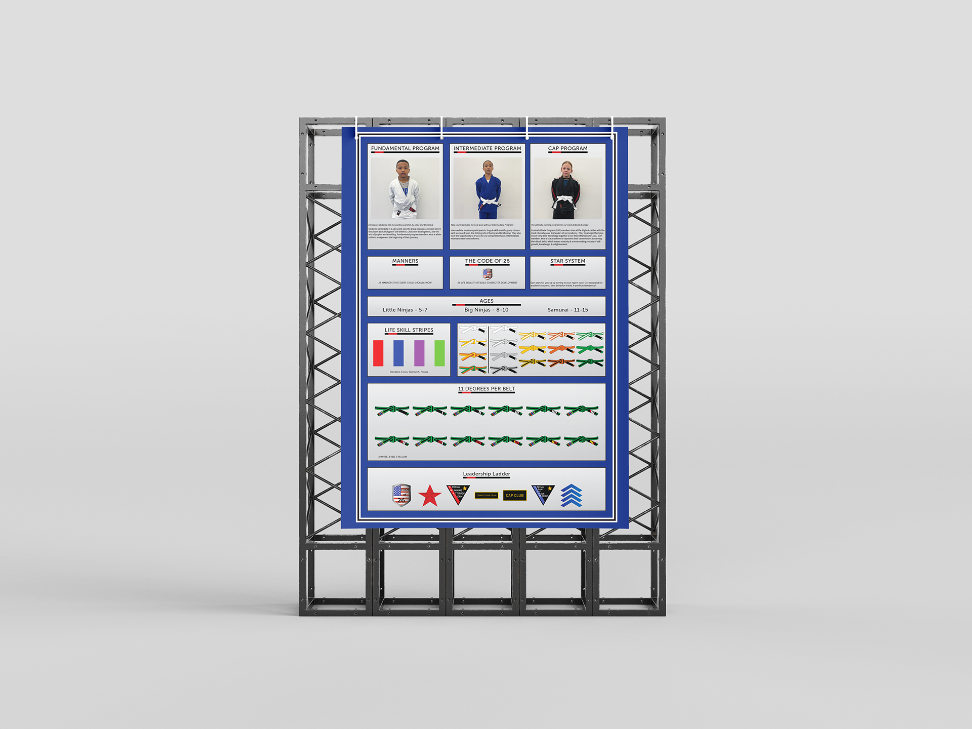
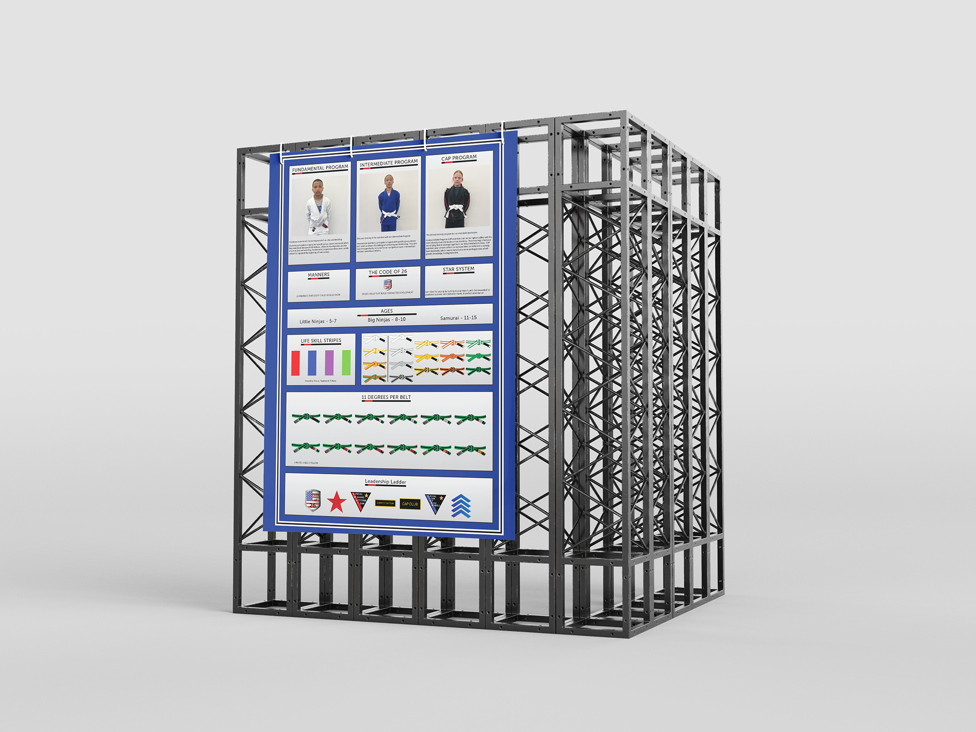
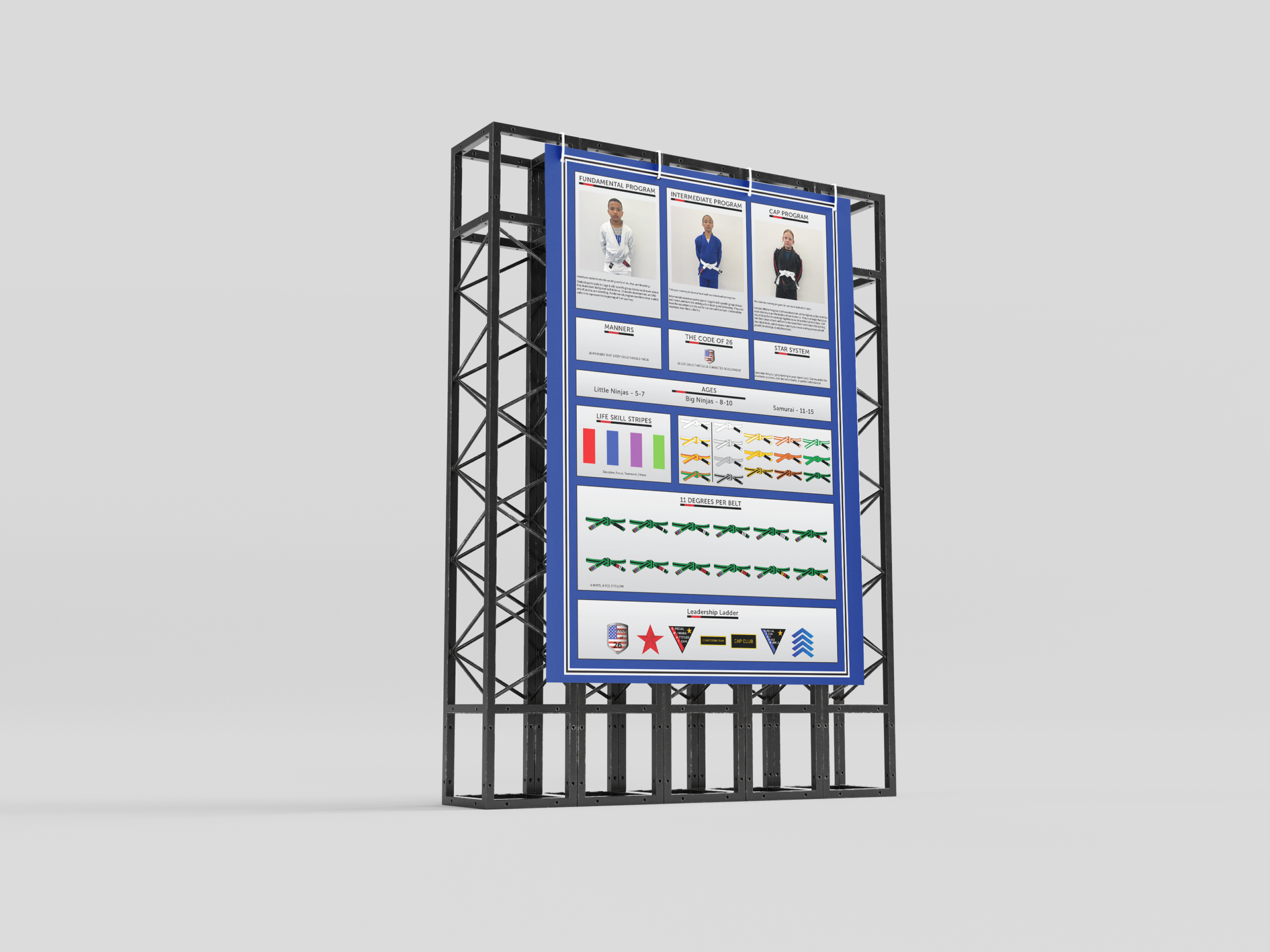
Gracie Owensboro Jiu Jitsu Academy Poster

Gracie Owensboro Jiu Jitsu Academy Brochure
The Process
Badges
Overview
The client provides patches to their students as they achieve certain criteria. In order to show what was offered on the poster and brochure, I needed to make some replicas for print.
Challenge
Replicating the badges in digital/print form.
Goal
To clearly represent what badges would be presented to students.

CAP CLUB Patch
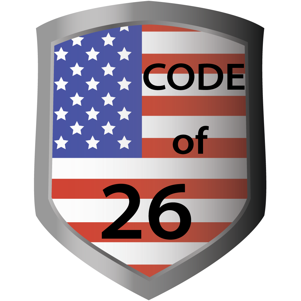
CODE of 26 Patch

Red Star Patch
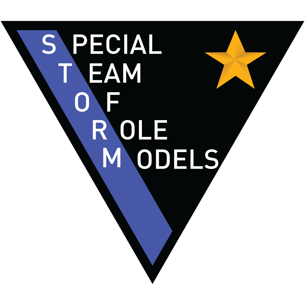
STORM Patch
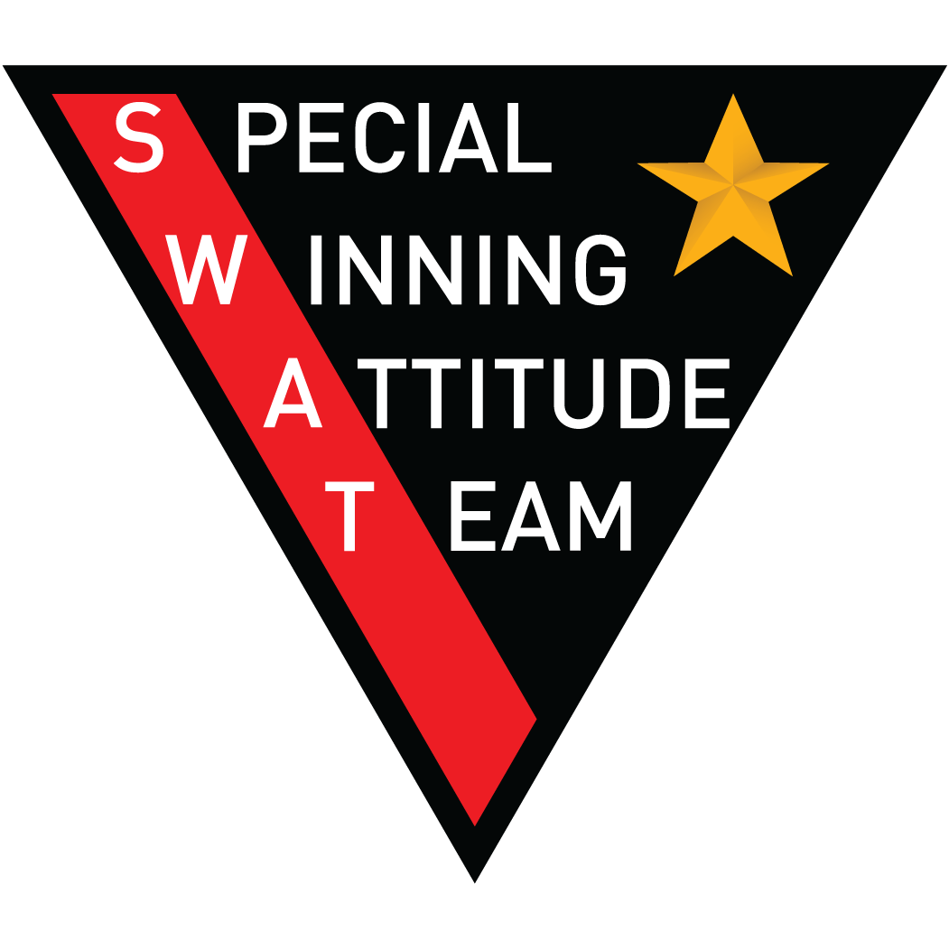
SWAT Patch
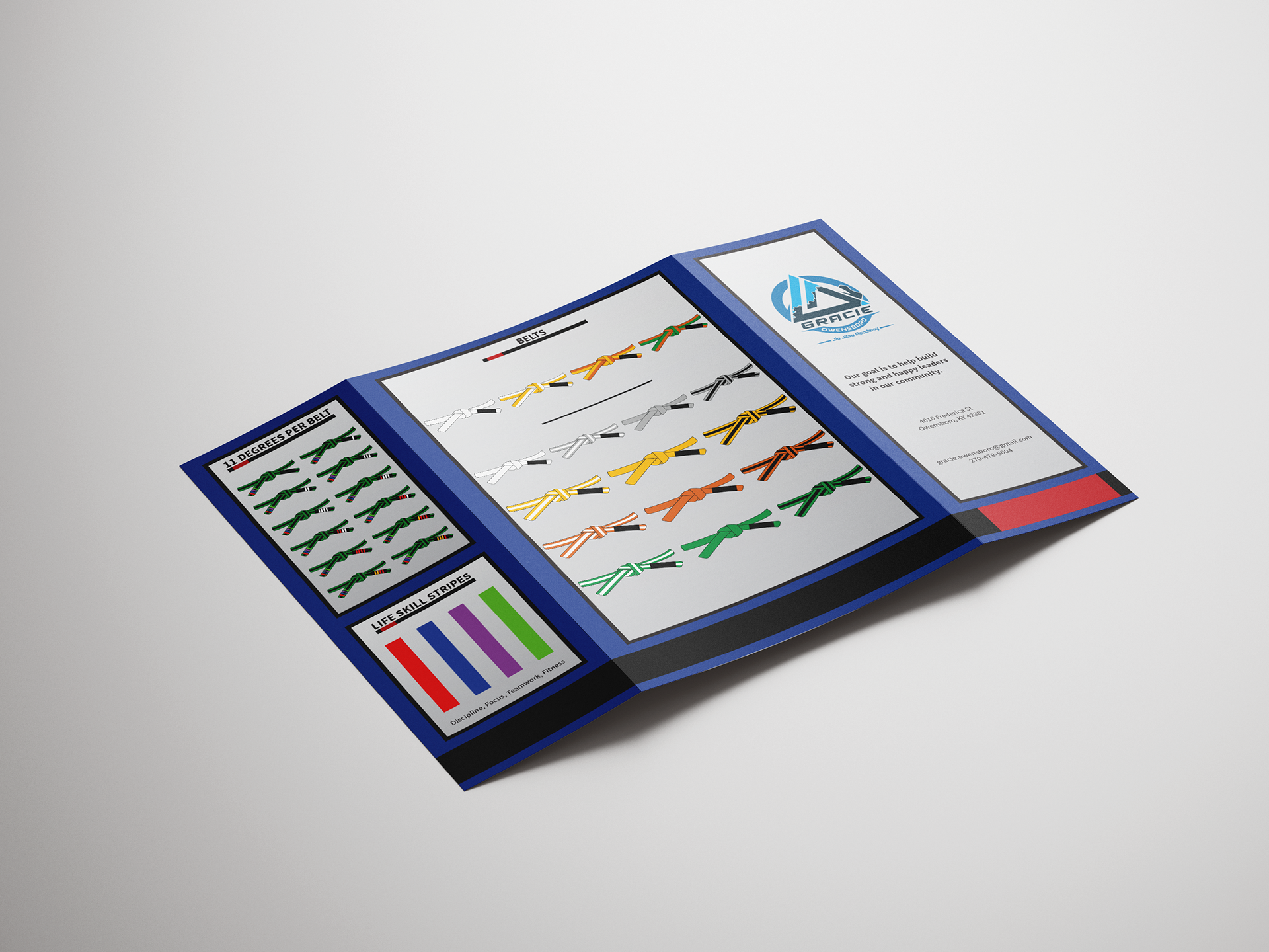
Belt Progression

Overview
A student's progress is shown through a belt system. The belts on the left are for the fundamental program and the belts on the right are for the intermediate program. I created different styles for the belts. Only showing the belt without the knot, just the tied knot, and a version with the degrees on the belt. In the end, I went with a clear representation of the belt leaving off the degrees to put the focus on the belt colors.
Challenge
Creating the right representation for the belt.
Goal
To represent the belts and show their progression.,
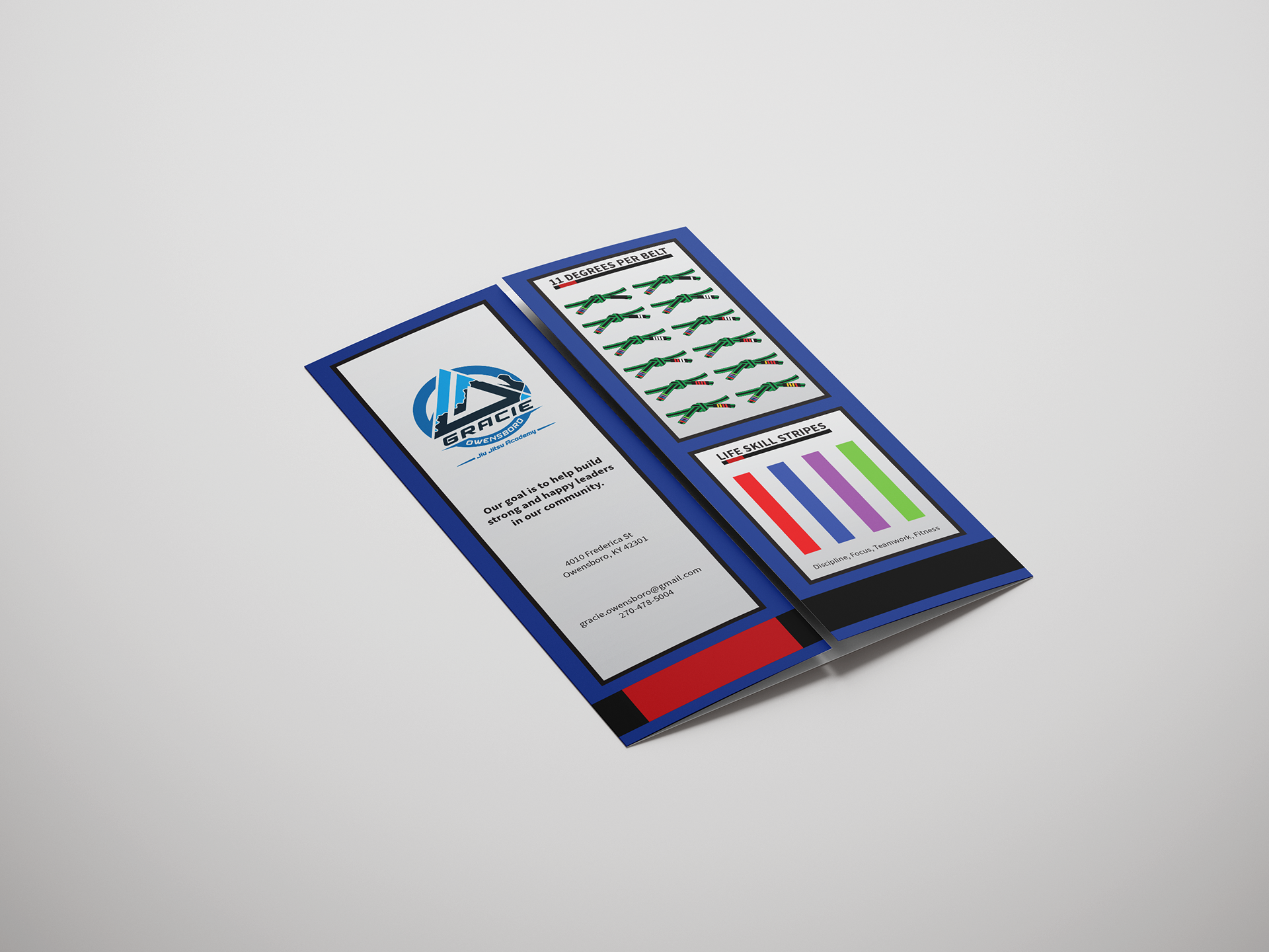
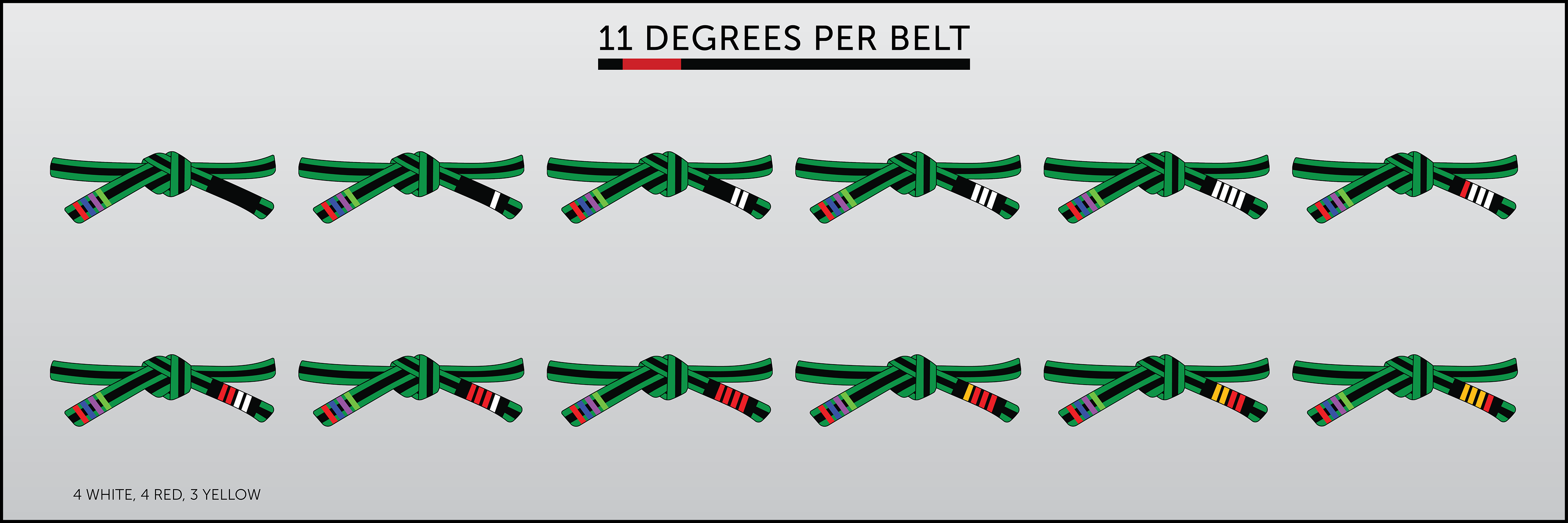
Belt Degrees
Overview
Each color of the belt has a degree progression to move up to the next stage. The red, white, and yellow stripes on the belt signify which degree you are at in your progression to the next belt color.
Challenge
The decision to present the degrees in a separate chart. By keeping them on the belt progression it would save space in the layout but wouldn't be as clear. Separating them allowed for a better presentation of information.
Goal
To make sure the presentation was clean and understandable to the participants.
Life Skill Stripes

Overview
The Life Skill Stripes are placed on the belts to remind the students about important skills they are learning and improving. I didn't want to lessen the visual impact the belts had by using them again.
Challenge
Whether or not to use the belts again to present the information.
Goal
To differentiate from the progression charts but clearly showcase an important aspect of what the participants would be learning.
Underline
Overview
The Underline was a way to give some hierarchy to the titles. In Jiu-Jitsu, the belt with a red band is considered to have a high skill level and can be an instructor. It's almost as if the instructor is presenting the information themselves. It not only separated the title from the information it brought some authority to it.
Challenge
Was to create an element that aided in the hierarchy.
Goal
To create an element to help with hierarchy.

Photos
Overview
The images give life to the system. It's not just words and icons. These are steps to progress. Young students are actually doing it and so can you. The original images were great. I just wanted to clean up the background to remove distractions from the students. It was requested to change the belt color of the student in a blue gi. Remove
Challenge
Cleaning up the images. I didn't want them to seem unreal but I wanted them to be clean.
Goal
Remove the distracting background and bring a little warmth into the image.
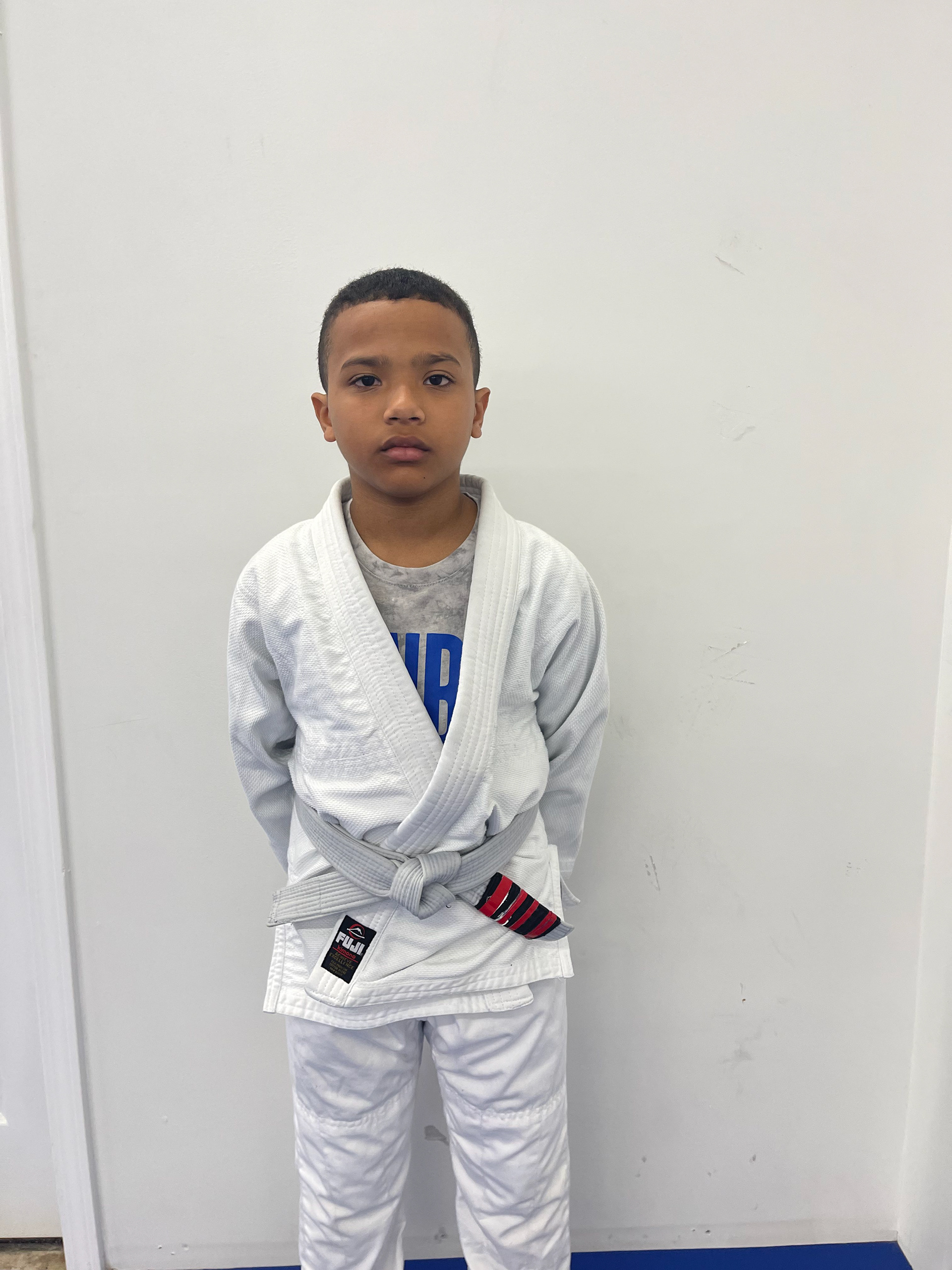
Original Fundamental Photo

Cleaned Up Fundamental Photo
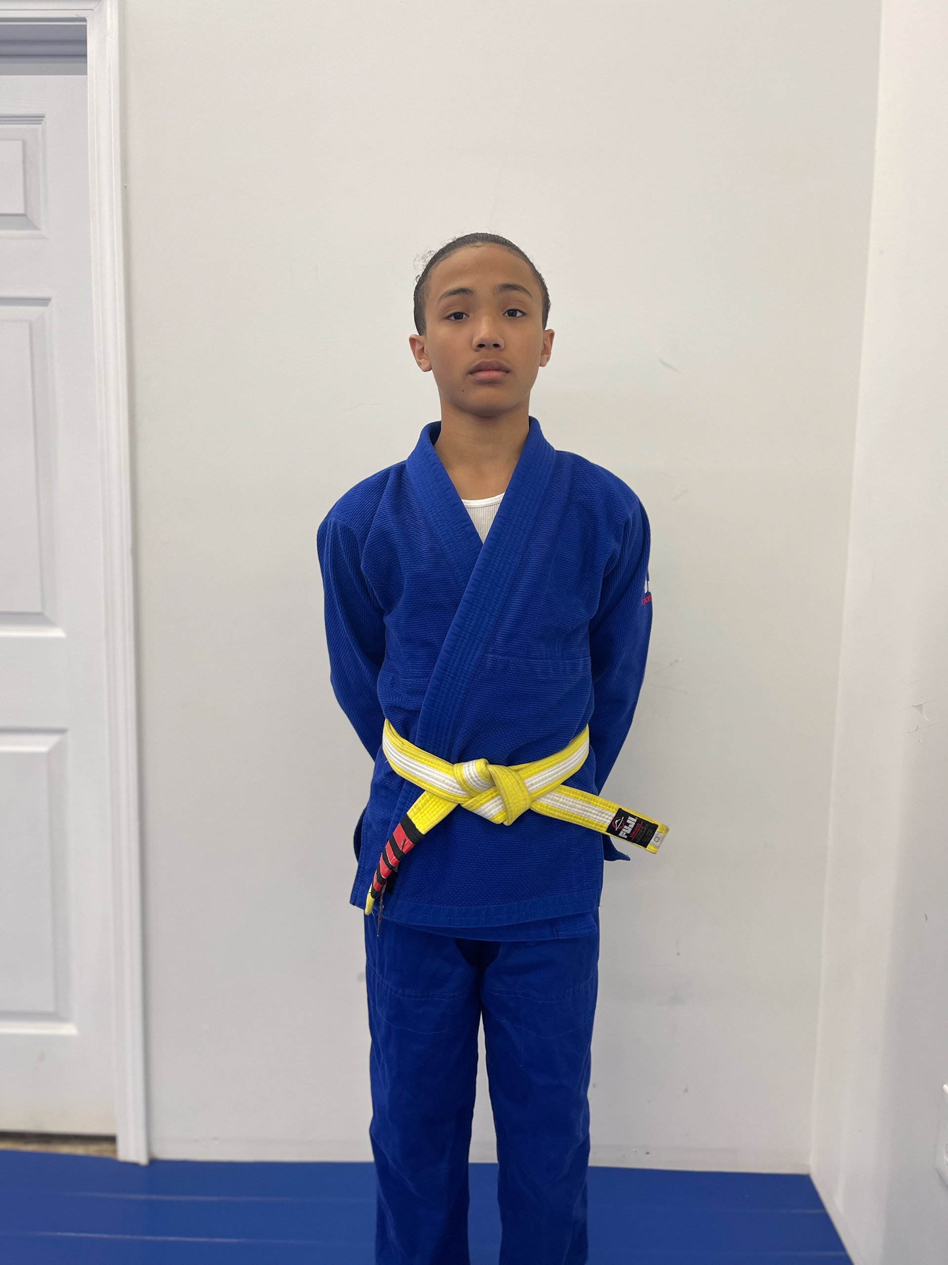
Original Intermediate Photo

Cleaned Up Intermediate Photo

Original Cap Club Photo

Cleaned Up Intermediate Photo
Finished Products
POSTER

Brochure
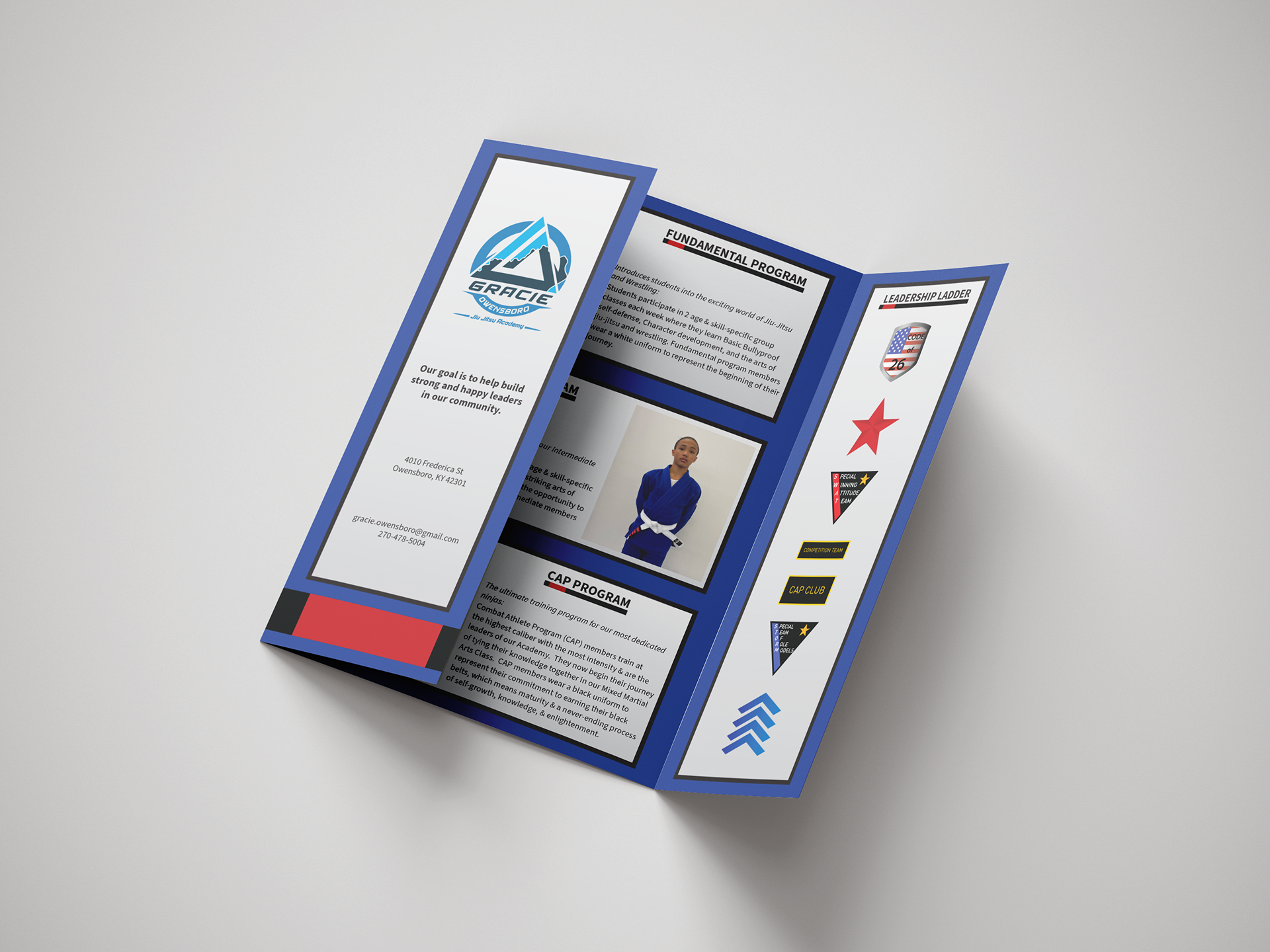
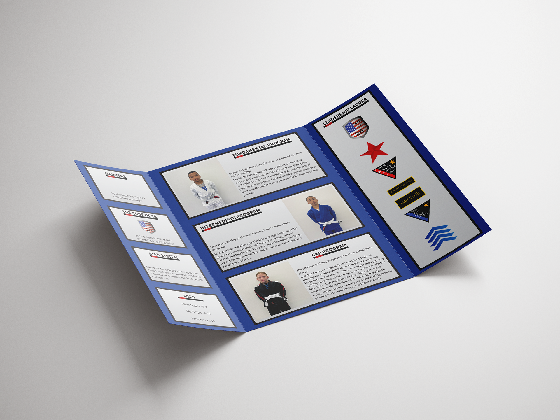
Overview
The brochure being requested after the poster meant I didn't need to create anything new. Everything had been designed in a modular format that allowed for easy rearranging. I looked around for different styles of brochures because the trifold brochure wasn't giving the space required. I decided on a double gate. This was perfect for presenting the information. The Programs and belt chart fit perfectly on the large middle sections. I was able to add the Underline belt to the bottom to simulate a belt being opened.
Challenge
To get everything to fit with the structure of information intact.
Goal
To fit in all the same information from the poster and keep them clean and purposeful layout. I also needed to fit the logo, tagline, location, and contact information on it.