Overview
J.E.B. is a producer that has a passion and the skills to produce music. J.E.B. wanted a business card that stood out from the rest. I knew that having a holographic card had a different feeling to it. It's something special. J.E.B being a sports fan immediately noticed my card having a resemblance to 90's sports cards.
Challenge
J.E.B. didn't have much branding to begin with. He had branding elements that we could include or refer to but many things needed to be created for the first time.
Goal
To take J.E.B.'s passion for music and sports to create a business card that would fit not only his growing profession but also his personality.
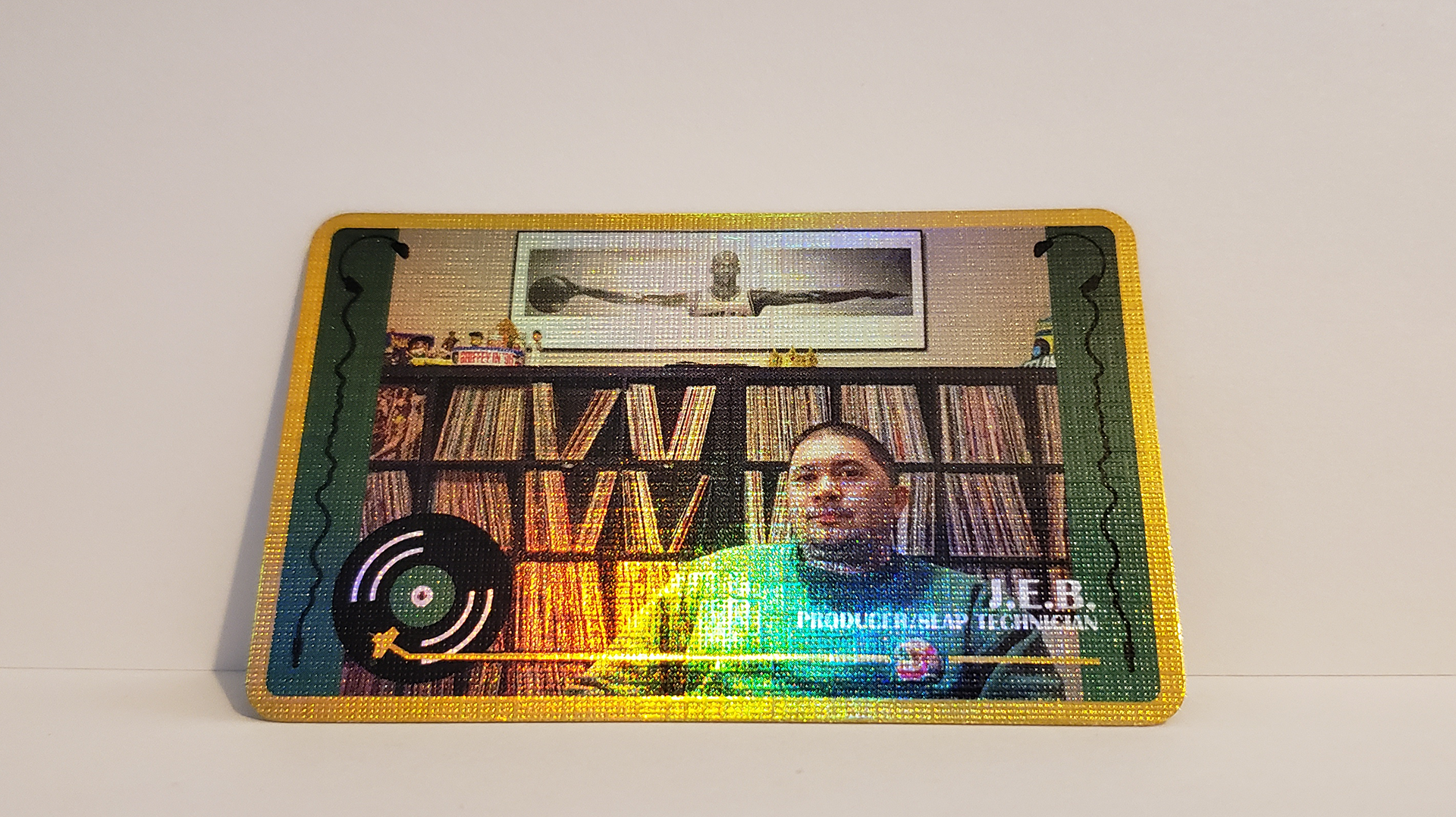
Finished Front J.E.B. Producer/Slap Technician Holographic Business Card
The Process:
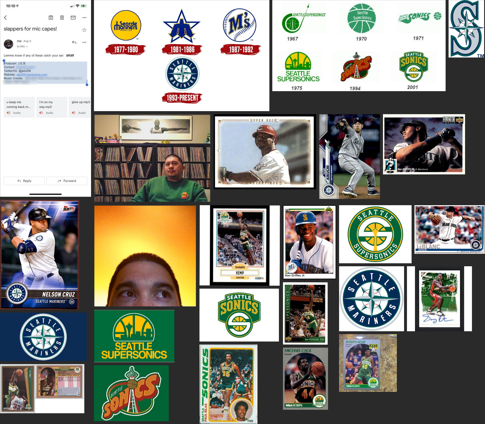
Mood Board with Seattle sports team's logos & 90's sports cards.
Overview
This is one of the first times I set out to create some branding presentation and mood board references to help with the process and to give the client some organized choices to go from.
Challenge
Since this was the first time I put fourth some organized resources for the client I wasn't sure how to present pieces of the project.
Goal
To begin to understand what kind of things I would be putting into a branding style guide.
The Color Scheme
Overview
J.E.B.'s love for Seattle sports teams was a good place to look for color schemes. I gave him the color schemes for the Seattle Mariners and the Seattle Sonics. He liked the Seattle Sonics' color scheme.
Challenge
Creating a color scheme that represented the client. J.E.B. used his initials as his Producer name. J.E.B.'s style comes from Rap, Hip Hop, Sports, and Sports Throwback cultures. His target market is the people in these same cultures and trends. Therefore, creating a color scheme was very personal but also related to those cultures.
Goal
Provide a couple of color scheme options with some visual representations so that J.E.B. could get a feel of how the colors would compare and contrast.
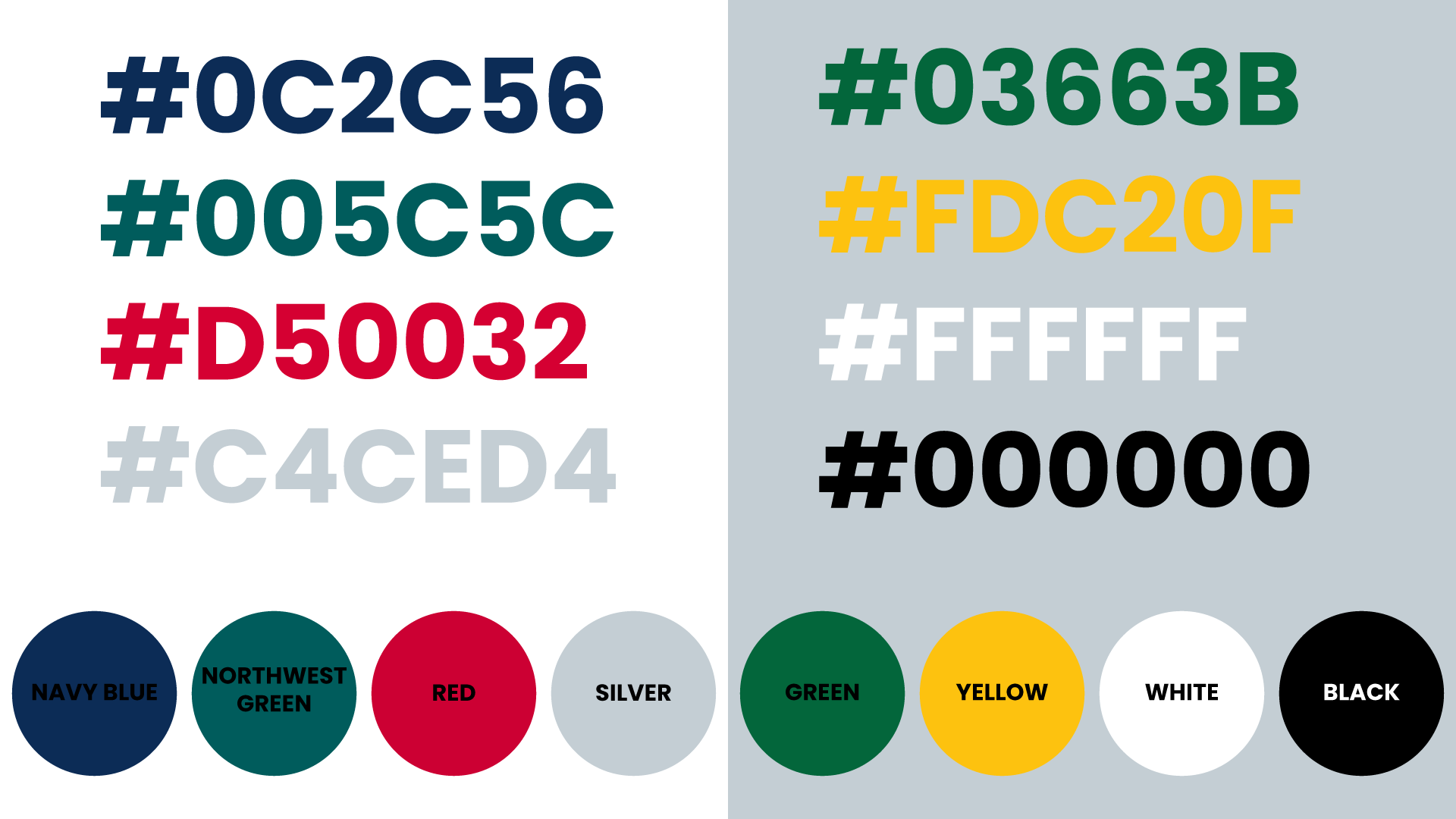
Colors & Hexcode
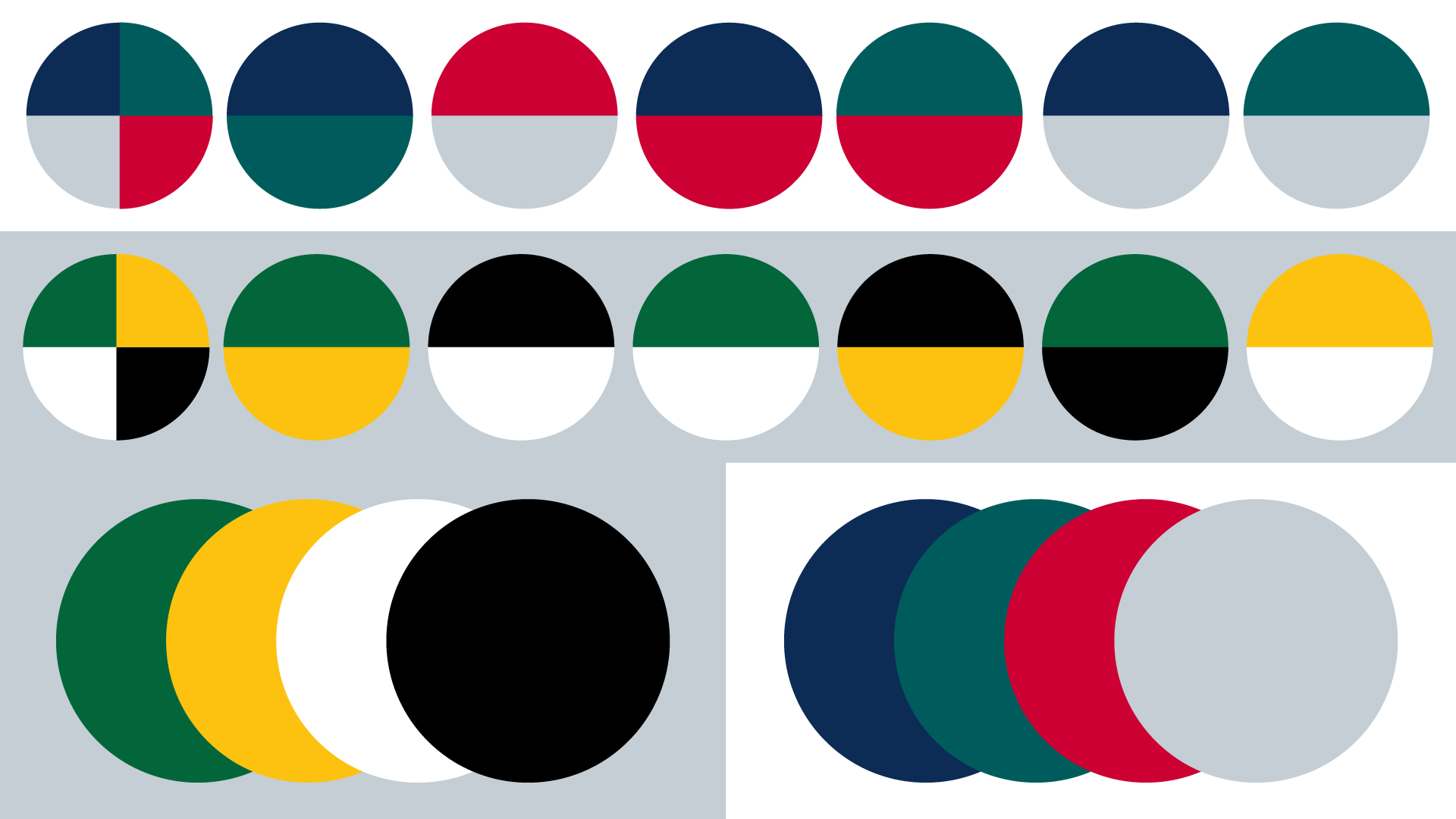
Color Comparisons

Color Comparisons In Text Form
The Typography
Overview
When it came to choosing which Typography J.E.B. would go with I presented four options. A clean bold type, a medium type, a bold type with some interesting characteristics, and a rounded bold type. In the end, J.E.B. chose one of the four options. Then I presented another option that I felt complimented his choice that could be used for his profession/tagline.
Challenge
Choosing typography that was bold & clean but brought some style to those elements.
Goal
Finding complementary types. J.E.B.'s first choice was a great choice but I felt the other three options were too similar to complement the tagline on the card.
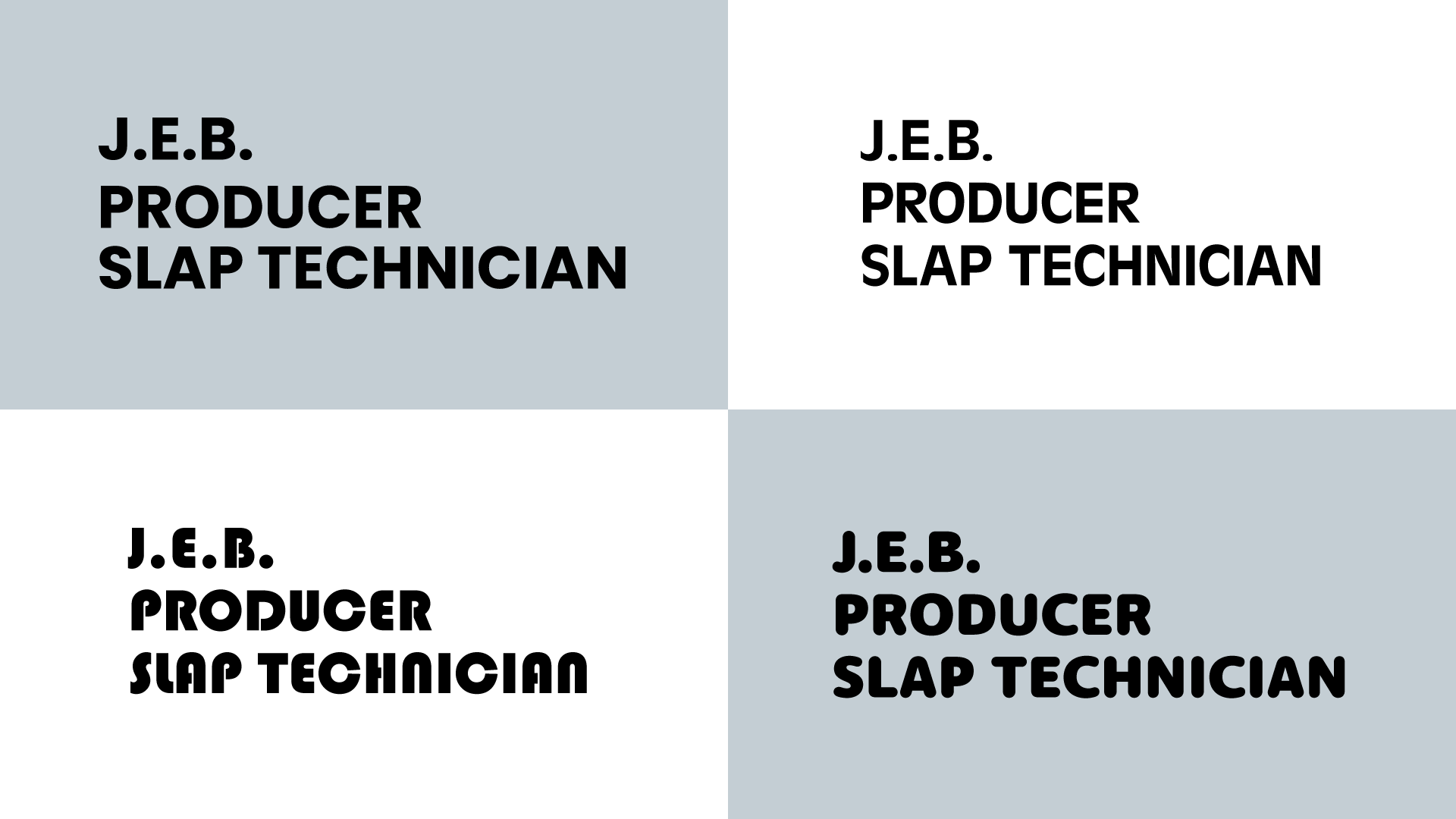
Four Typography Options
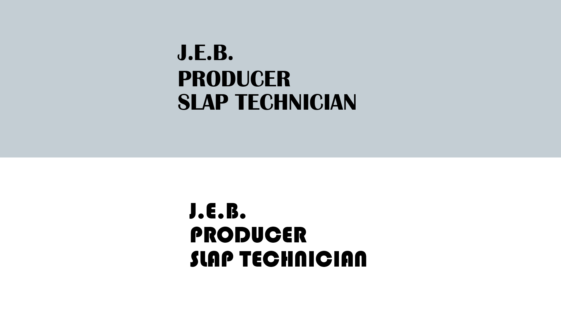
Typography Choices
Front Side of J.E.B.'s Business Card
Overview
A basic business card utilizes only the front of the card. J.E.B.'s was going to utilize both sides and the front of the card was going to be similar to a sports card.
Challenge
Fitting the photo, name, tagline, and a few graphical elements to help create that sports card feel.
Goal
To bring in some graphical elements to capture J.E.B.'s skills & personality. On a sports card, there are sporting elements. This was a music producer's card so it needed to show the music.

Front Side J.E.B. Holographic Business Card
The Photo
Overview
Choosing the photo for the card was something that was more up to J.E.B. He provided two options to put on the card. My input here was about how the image would dictate the orientation of the card. I also felt that the second option provided more of J.E.B.'s personality and showed his passion for music.
Challenge
Cleaning up the photo once the second option was chosen.
Goal
To straighten the poster and remove the boxes in the bottom right corner.

Option 1: Orange Background with Only Eyes

Option 2: J.E.B. sitting in front of Records & Sports memorabilia
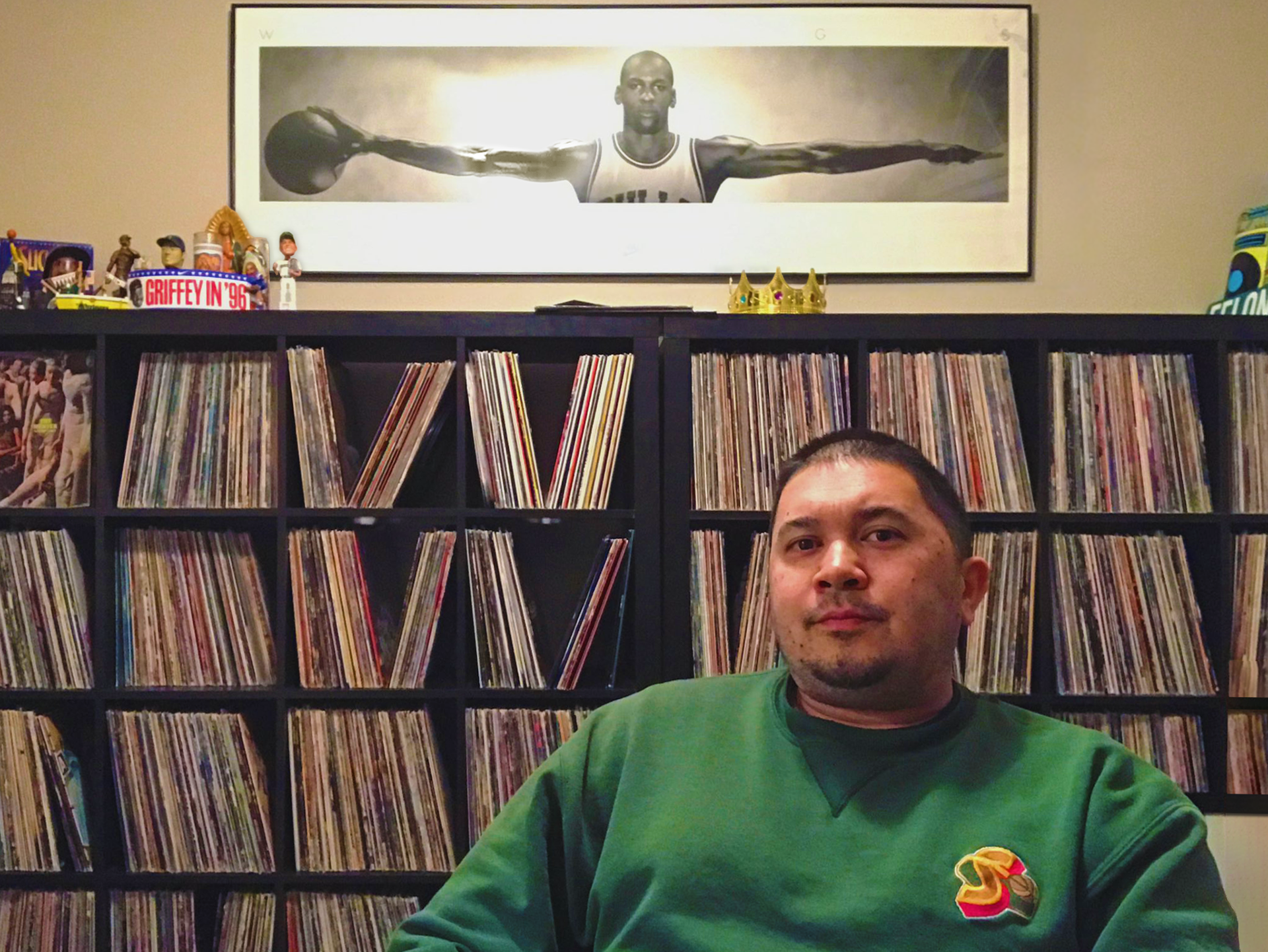
-Straightened the poster slightly so the image didn't look like it was leaning to the right.
-Reduced the glare on the poster and rebuilt the arm.
-Centered the poster.
-Removed the boxes in the bottom right corner.
-Added some saturation to bring out some of the colors in J.E.B. & the rest of the image.
The Record Pin Stripe

The first version of the J.E.B. Space Needle Record Logo
Overview
Many of the sports cards had some sort of graphical elements around the name of the player. There is also the team's logo that the player plays on. I went with a record because that represented music and J.E.B.'s passion for it. Then used the shape of the Seattle Space Needle to represent the needle that would play the record.
Challenge
To create a logo and a graphic element to house J.E.B.'s name and tagline.
Goal
My goal here was to create some graphics that not only worked on this card but also allowed J.E.B. to use them elsewhere in the future.
Audio Wave Headphones
Overview
Another graphical element I added to the card was some headphones. The Interesting thing about the headphones is that the wire was created by following one of the audio waves of a J.E.B. created instrumental.
Challenge
Coming up with an idea to tie it back to J.E.B.
Goal
My goal with the headphones was not to just create a graphic asset to put on the card but to tie it to J.E.B.

Headphone Speaker

Headphones

Headphones, Waveform Wire, and Headphone Jack
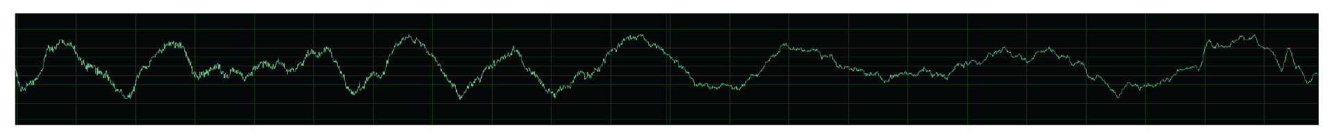
J.E.B. Original Beat Wave Form

J.E.B. Original Beat Wave Form Overlaid Line

J.E.B. Original Beat Wave Form Line
Back Side of J.E.B.'s Business Card
Overview
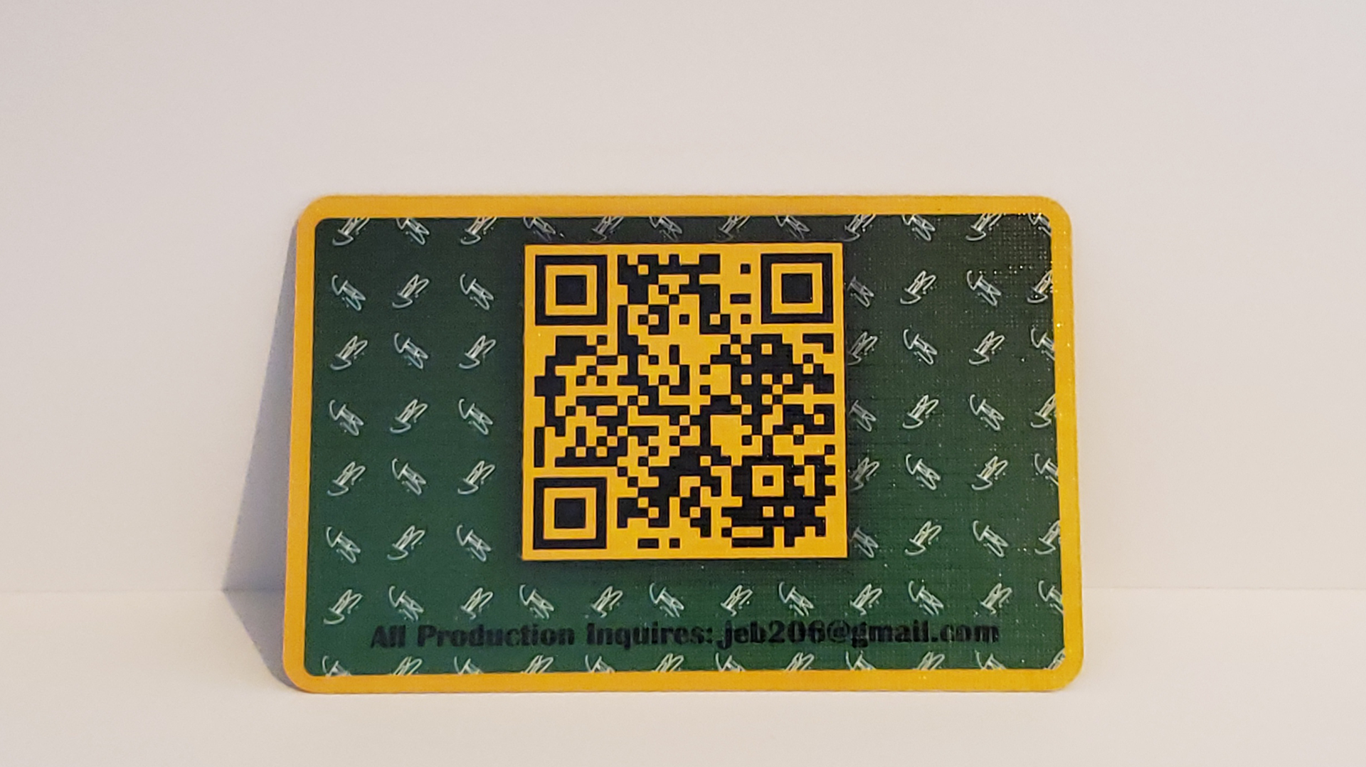
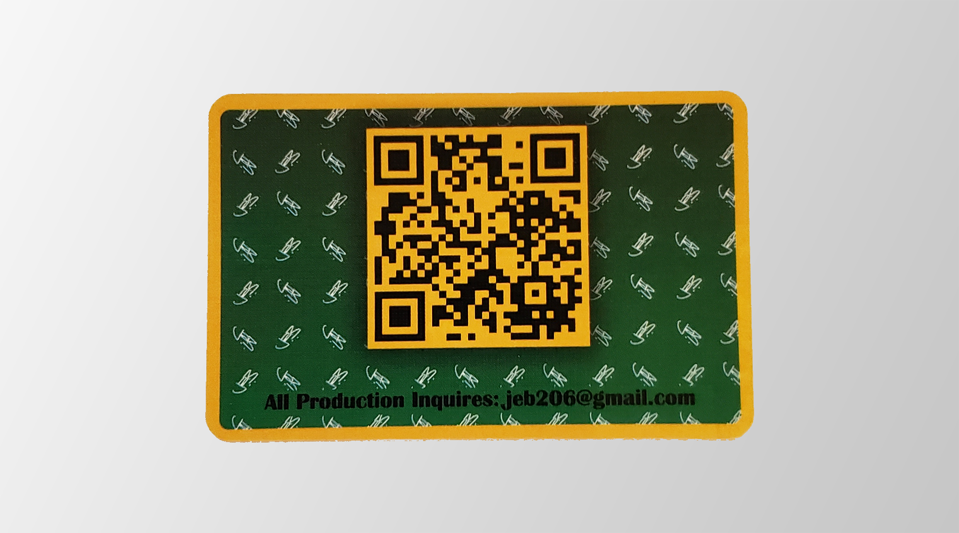
This is the side of the card where contact information would be provided. Something that we came up with was adding a QR code on the back. This would allow someone to access the information digitally. It would also keep the card mostly timeless. The QR code information could be updated with contact information and other things because that information would be digital rather than printed on the physical card. We did decide to put the email on there just in case QR scanning wasn't easily accessible at the moment of exchange.
Challenge
Making the back side of the business card modernized.
Goal
My goal was to provide the necessary information for the contact.
Pattern

J.E.B. signature pattern on green gradient.
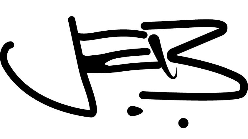
J.E.B. signature
Overview
On The back of J.E.B.'s card, the background was a solid green. We wanted to break that up some. We decided to add a J.E.B. signature he had used before.
Challenge
Breaking up the plain green background.
Goal
To make it pleasing but not overbearing. I wanted to make sure the QR code was the focus and not obstructed.
QR Code
Overview
The QR code was an idea brainstormed by J.E.B. and me. I mentioned how Linktree was an option that people were using quite frequently as a landing page. He said he had a QR code from shor.by so we used that.
Challenge
Making it fit into the design.
Goal
To make sure it wasn't a white and black QR code and fit in the design.

J.E.B. QR code
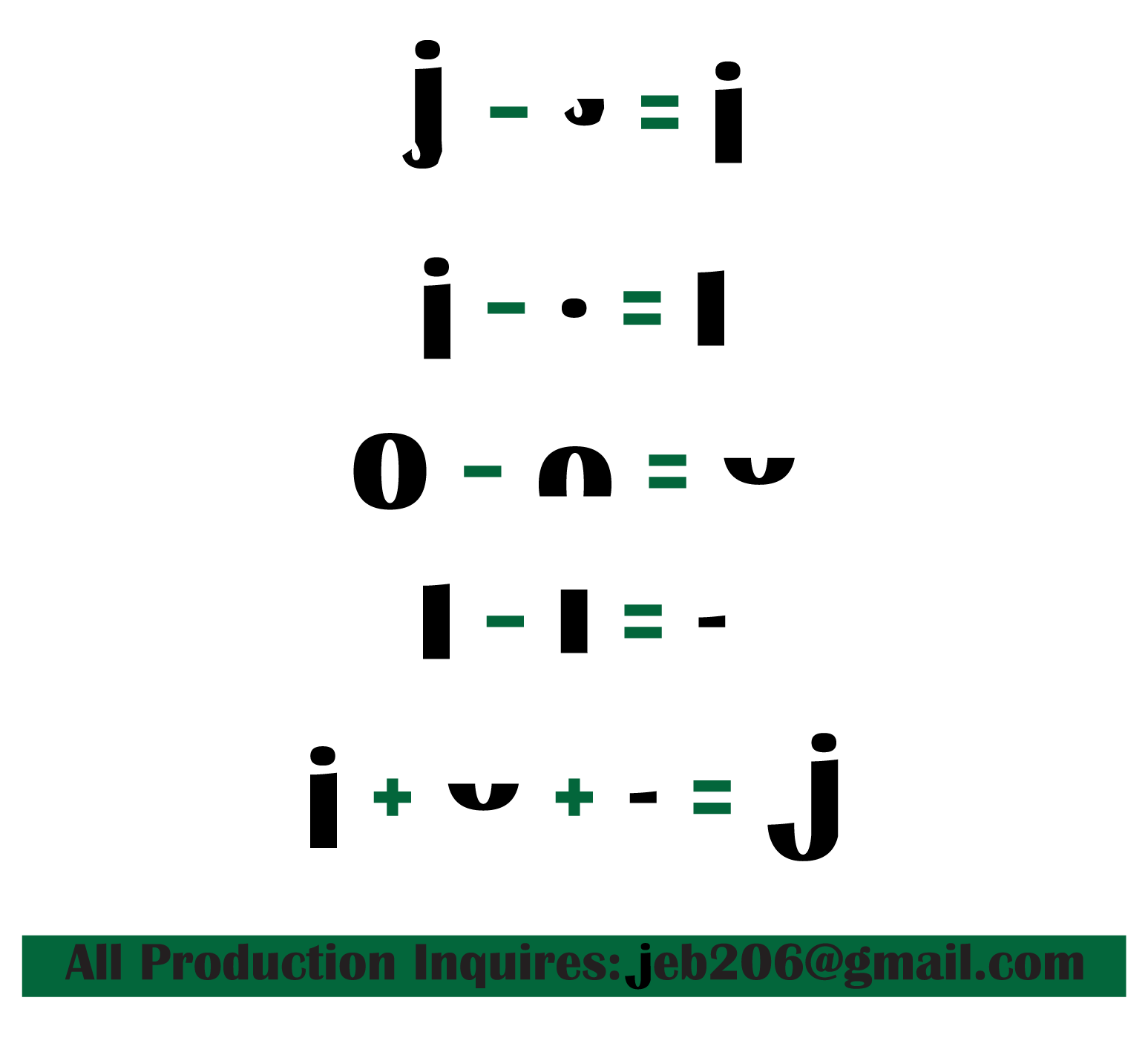
Typography For Email Address
Overview
We wanted to put the email on the back of the card to make sure there was some contact information just in case the QR code wasn't accessible immediately.
Challenge
The lower case 'j' just didn't fit with the style we were presenting for J.E.B. So I had to remake it to fit in with the rest of the typography and style.
Goal
To remake the lower case 'j' from other letters to keep the same feel from the typography but remake it so it fit the overall style for J.E.B.
The Finished Business Card

Front Side of Holographic Business Card Laying Flat

Front Side Standing Angle Holographic Business Card
Back Side Business Card Laying Flat